While a brand is more than a logo, we believe our new logo speaks to many of the qualities that earned us the WIOA Trailblazer Award last year.
Unveiling our new logo at our open house in February, we shared a new way to represent our organization to our funders, participants and partners. Our brand is about who we are and where we are heading.
Local agency Janitor worked on this rebrand with us.
See if you picked up on these elements in our new logo:
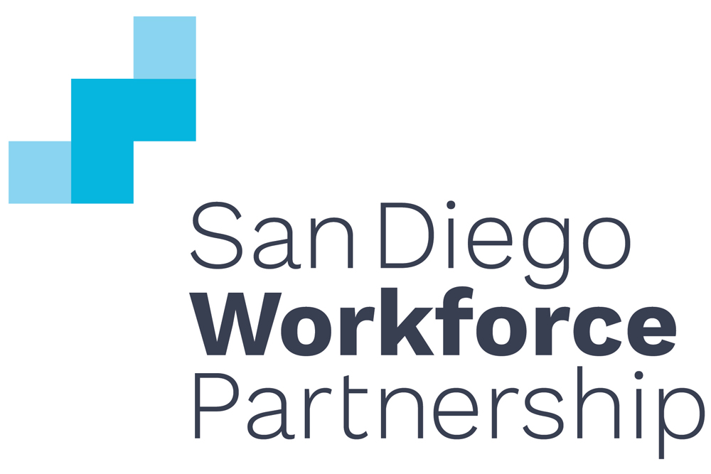
- Building blocks
The symbol in our new logo contains five squares—very basic shapes that form the foundations of great things to come.
- A staircase
The squares form a staircase, evoking progress and transformation—we accomplish change one step at a time. It is also a nod to income mobility—an emphasis for us as we focus on quality jobs.
- The letter “W”
Highlighting the most important word in our name, the symbol is a sideways letter “W,” calling out workforce as the core of who we are and what we do—studying the labor market and serving our workforce by better understanding employer and job seeker needs.
- Data-driven
The symbol is also a reference to bar charts and graphs; after all, we strive to use research and evidence to design better programs and projects, and measure our impact to better understand their effectiveness.
- Friendlier font
The typeface in our new logo is coincidentally from a font family called Work Sans. It is more modern yet warmer than the type in our old logo (which was incidentally called Bank Gothic).
Guests who attended our open house enjoyed seeing our new look and feel, which included our new offices and new website, all unveiled to the public together.
Congrats to @sdworkforce on your beautiful new offices and inspiring team—working to assure we are a community of opportunities. @PeterACallstrom @s_burns11 @HASDIC pic.twitter.com/4vwXEF1R58
— Lisa Sontag (@LisaHASDIC) February 21, 2019
@sdworkforce has a new home near @SDGE headquarters in Kearny Mesa — welcome to the neighborhood!